Note before you begin: If you are having trouble viewing these lab instructions, I recommend using Firefox on a desktop computer or laptop (not mobile device)
All MATLAB code examples for this lab are collected here.
Objectives
The objectives of this lab are to learn how to visualize signals in MATLAB. This requires two
tasks:
Use the functions in MATLAB to create or import signals
Plot the signals as functions of time, with appropriate scales for the x and y axis so that the plot is meaningful
and easy to see.
Introduction - Why Study Sinusoids?
Sinusoids are the "building blocks" of all (reasonably well-behaved) signals. By adding enough sinusoids
- sometimes an infinite number - with the correct amplitudes, frequencies, and relative phase
angles, we can create any signal. Sinusoids are described in mathematics using the cosine function (or
sin function) or by complex exponentials \(e^{j\theta}\).
In engineering, many systems ,such as RLC circuits and small signal amplifiers,
can be accurately described as linear Time Invariant (LTI) systems.
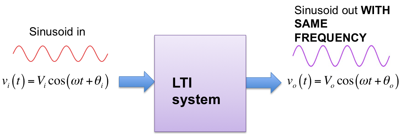
It is straightforward to show that if a sinusoidal signal is input to an LTI system, the output will always be a sinusoid with
the same frequency (though, in general, the output will have a different amplitude and phase). This is
illustrated in Figure 1 for a cosine function. This means that a 100 Hz sinusoidal signal input to an LTI system
will always result in a 100 Hz sinusoid output (zero output would be regarded as a 100 Hz sinusoid with zero amplitude).
If a 100 Hz sinusoid input results in a
300 Hz output then the system is not LTI. If a 100 Hz sinusoid input results in a square
wave output then the system in not LTI. LTI systems are generally much easier to analyze
and characterize than nonlinear and time-varying systems.
Thus if we can determine how an LTI system will effect sinusoids,we can determine how the system will effect
any other signal by first describing the signal as a sum of sinusoids and then determining the effect of the system on
the sinusoids separately. This is the motivation for working with sinusoids.
Figure 1. LTI System. Sinusoid in. Sinusoid out.
Spectrum of periodic and quasi-periodic signals
The frequency spectrum of a signal is the frequency content of a signal.
Spectral analysis is a widely used and powerful method of data analysis, which
determines the spectrum of a time-varying signal.
The spectrum of periodic signals is usually represented as vertical lines, called line
spectra, whose frequencies and amplitudes are indicated on the x and y axes, respectively.
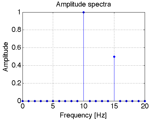
For example, suppose a signal is represented by:
\begin{equation}
x(t)=\cos(2\pi10t)+0.5\cos(2\pi15t)
\end{equation}
The frequency spectrum can be plotted either as single-sided or double-sided.
In the single-sided spectrum, the vertical lines represent the amplitudes of the sinusoids
(cosines) that comprise a function.
The single-sided spectrum for this example is represented in Figure 2. This plot was generated using the stem
plotting command in MATLAB. Click here
to view the MATLAB script used to generate this plot.
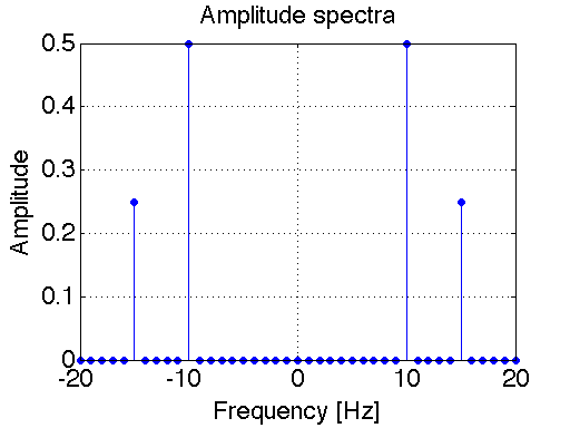
The double-sided spectrum is more general than the
single-sided spectrum in that is can represent the spectra of both real and complex signals.
In the double-sided spectrum, the vertical lines represent the amplitudes of the complex
exponentials (\(e^{j2\pi f_0t}\)) that comprise a function. It results from Euler's Equation,
which says that we can decompose a sinusoid into a sum of two complex exponential functions:
\begin{equation}
A\cos(2\pi f_0t) = A\frac{{e^{j2\pi f_0t}+e^{-j2\pi f_0t}}}{2}
\end{equation}
Looking at the equation above, we see that
the amplitude of the double-sided spectrum for \(A\cos(2\pi f_0t)\) is \(A/2\) at frequencies
\(f_0\) and \(-f_0\).
Therefore, the double-sided spectra for a general function \(x(t)\) looks just like the
single-sided spectra at positive frequencies (\(f>0\)). The only difference is that
the amplitudes of the double-sided spectrum are one-half as large (i.e. the vertical lines
are one-half as long) compared to the single-sided spectrum.
If a DC component exist (i.e. a component at (\(f = 0\)) then this spectral component is
identical for bot single-sided and double-sided spectra. Figure 3 shows the double-sided spectrum
for the signal given in Eq. (1). Click here
to view the MATLAB script used to generate this plot. Note the similarities between Figures 2 and 3.
The fundamental frequency is the
greatest common divisor of all the frequencies present in the signal. The
fundamental frequency of the signal given in Eq. (1) above is 5 Hz, so \(x(t)\) will repeat
every 1/5 = 0.2 seconds. Non-periodic signals can have discrete line spectrum as well.
These types of signals are called "quasi-periodic" (or sometimes "non-periodic" or "almost periodic").
If in our previous example we change the 15Hz component to \( \sqrt{8} \) Hz it will never repeat,
since \( \sqrt{8} \) and 10 do not share a common divisor. However,
this signal is still composed of two sinusoids, which are represented as line spectra.
On the other hand, if in our previous example we change the 15Hz component to 15.21 Hz it will repeat,
since 15.21 and 10 share 0.01 as the common divisor. In this case \(x(t)\) would repeat
every 1/0.01 = 100 seconds
Figure 2. Single-sided spectrum of \(x(t)=\cos(2\pi10t)+0.5\cos(2\pi15t)\) Figure 3. Double-sided spectrum of \(x(t)=\cos(2\pi10t)+0.5\cos(2\pi15t)\)
Sampling
In this lab we will be creating (simulating) analog signals on a computer using MATLAB.
This takes a bit of careful thinking. True analog signals are continuous signals (continuous
in both amplitude and time). However, computers deal with digital signals that are
both discrete in time and amplitude. Discrete amplitudes aren't usually a problem, since MATLAB
can handle large floating point numbers. However the time instances for a signal are not selected automatically in
MATLAB. Meaning that if we chose too few points in time to define our signal, it will not
be plotted smoothly.
Soon you will learn that the minimum sampling frequency that you can
have for a signal is \(2f_{max}\),where \(f_{max}\)= the maximum frequency of the signal being sampled.
This prevents Aliasing. You need not worry about aliasing yet, just remember to select enough
time samples for your signal so that the plots appear smooth. For a sinusoid a smooth plot will
have a sampling frequency 25 - 100 times the frequency of the signal. In the examples you will
see that I have selected appropriate sampling frequencies for plotting each signal.
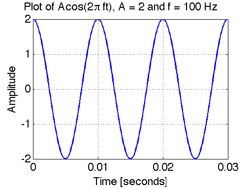
Example 1 - Plotting a sinusoid
Consider the following sinusoidal signal:
\begin{equation}
x(t)=A\cos(2\pi f_0t+\phi)
\end{equation}
We will simulate the signal with the following parameters:
\(A = 2\)
\(f_0 = 100 Hz\)
\(\phi = 0\)
There are a couple key choices when plotting signals with MATLAB.
Choice 1: Choose the time-span of the plot
A true sinusoid is everlasting - it started at negative infinity (before the Age of the Dinosaurs) and will continue into the
indefinite future forever (long after the Sun consumes the Earth). It is impossible to plot an everlasting
signal, so let us choose to plot the sinusoid starting at t = 0 and end at 3 periods (\(3T\)).
This is a reasonable time span for the purposes of visual communication (it is not too "zoomed in" nor too "zoomed out").
Since \(f_0 = 100 Hz\), the period \(T = 1/f_0 = 0.01\) seconds. Hence we will plot the signal between 0 seconds and 0.03 seconds.
Choice 2: Choose the sampling frequency
As mentioned above, \(x(t)\) is a continuous time-wave form. MATLAB cannot plot
continuous-time signals directly. Instead it plots the waveform at isolated (discrete)
points in time. By default, MATLAB's plot function then automatically connects those points
with straight lines. Here we will choose a sampling rate that is 100 times the frequency
of the signal: \(f_s = (100)(100) = 10000 Hz\). In other words, we choose to plot the sampled
continuous-time signal \(x(t)\) at equally spaced time instances \(T_s = 1/f_s = (100)(100) = 0.001\) seconds.
With this choice, our plot will appear to the eye continuous (more-or-less).
The plot is shown in Figure 4 below. The MATLAB script used to generate this example is
available here.
Figure 4. Plot of sinusoidal signal
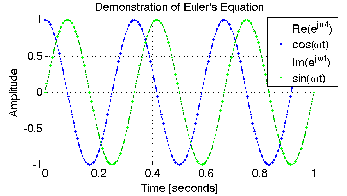
Example 2 - Euler's Identity
In this example we will simulate and plot two signals to demonstrate Euler's equation.
Euler's identity is given as:
\begin{equation}
e^{j\theta}=\cos(\theta)+j\sin(\theta)
\end{equation}
We will simulate the signal with the following parameters:
\(\theta = 2\pi f_0t+\phi\)
\(f_0 = 3 Hz\)
\(\phi = 0\)
The plot is shown in Figure 5 below. The MATLAB script used to generate this example is
available here.
Figure 5. This plot shows the complex signal \(e^{j\theta}=\cos(\theta)+j\sin(\theta)\) with
\(\theta=2\pi ft=\omega t\). Here, the complex exponential \(e^{j\theta}\) is plotted
as solid lines for real and imaginary parts, and
\(\cos(\theta)+j\sin(\theta)\) as dots for real and imaginary parts. Notice
the real part is the cosine function, while the imaginary part is the sine function.
Since, the solid lines and the dotted lines overlap exactly, this plot demonstrates
the validity of Euler's Identity: \(e^{j\theta}=\cos(\theta)+j\sin(\theta)\).
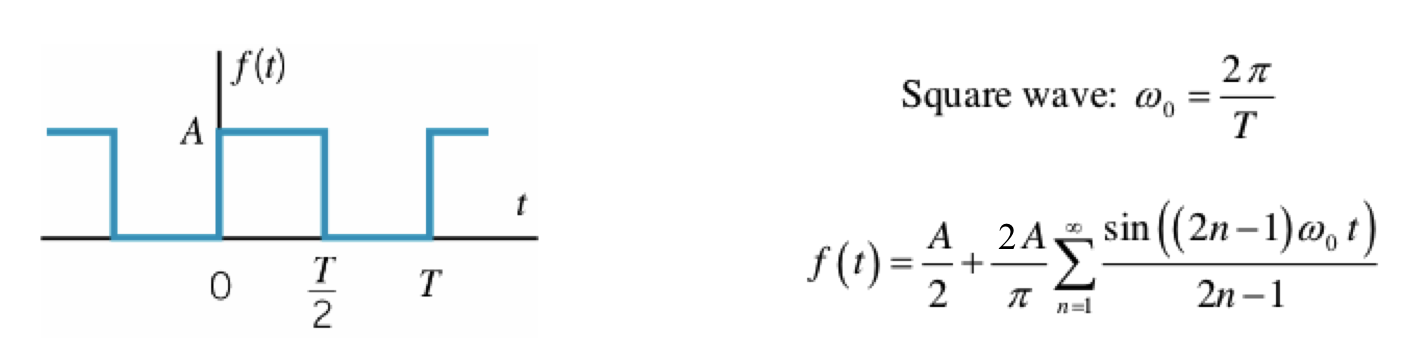
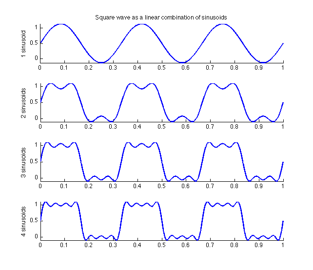
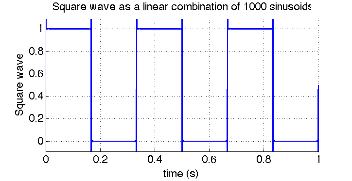
Example 3 - Signals as a sum of sinusoids
In this example we demonstrate the linear combination of
sinusoids that are present in a square wave. If you search for "Fourier Series Table",
you will find a plethora of tables available online, which
present the Fourier Series of many waveforms. The Fourier Series of a square wave is shown below
in Figure 6 below. Using this Fourier Series, we simulate in MATLAB how adding up various numbers
of sinusoids approximates a square wave. The resulting plots are shown in Figure 7 and Figure 8.
The MATLAB script used to generate this example is
available here.
Figure 6. Fourier Series of a square wave.
Figure 7. Summing the first four harmonics of a square wave. Figure 8. Summing the first 1000 harmonics of a square wave.
Example 4 - Using MATLAB's FFT function to find the spectrum
Later in this course we will study the Discrete Fourier Transform (DFT) and
Fast Fourier Transform (FFT) in detail. For now, lets take an initial look at how
to use MALTAB's FFT function for spectral analysis.
Consider the sinusoidal signal given in Equation (1). We shall repeat it here again for
convenience:
\begin{equation*}
x(t)=\cos(2\pi10t)+0.5\cos(2\pi15t)
\end{equation*}
Figure 9 shows the spectrum of this signal, as computed using
using MATLAB's FFT function. Compare the double-sided spectrum shown in
Figure 9 with that shown in Figure 3. Qualitatively, they are very similar. The ripples
and "signal spread" exhibited in Figure 9 are due to windowing, which we will study more
about later in this course. For now, you can think of windowing like this: A true sinusoid
is everlasting (it starts at t = -infinity and ends at t = +infinity). However, with MATLAB
we can only simulate a sinusoid that exists for a finite time. Hence the FFT of a sinusoid
gives, in fact, the spectrum of a truncated sinusoid (not an ideal everlasting
sinusoid). This fact gives rise to the differences between Figure 3 and Figure 9.
In Figure 9, the time-window was chosen as 1.3333 seconds. If we increase this window, then
the spectra will be "sharper" (approaching that shown in Figure 3)
The MATLAB script used to generate this example is
available here.
Figure 9. Spectrum of \(x(t)=\cos(2\pi10t)+0.5\cos(2\pi15t)\) computed w/ MATLAB's FFT function
Tasks
Report guidelines
For the lab report, you will create a PowerPoint presentation (or use a similar presentation program), save it as a PDF, and
submit it on-line according to the instructions given in class.
All submitted Matlab code should be well organized and commented with clear comments for easy readability.
All submitted plots should be easy to see and well-labeled.
You are to work independently.
This is not a team assignment.
Feel free to help your fellow classmates understand principles and concepts, but please do not
share your work.
Your presentation will have 23 slides. Please include a slide number in the footer of each slide. To earn full credit your presentation must
contain the slides in the order asked for in this lab. If you miss a slide, please leave a blank slide in its place so that you have
still have exactly 23 slides total. Your first slide should be:
Slide 1: Title slide with your name, student ID number, date, lab name, class number/title.
Sinusoids and Euler's Equation
Consider the following continuous time signal: \(x_1(t)=(1+\cos(2\pi20t))\cos(2\pi100t)\).
Use Euler's Identity to re-write the previous signal \(x_1(t)\) as a new signal \(x_2(t)\) that is a sum of three sinusoids.
Show your derivation and final result in Slides 2 - 3.
Plot \(x_1(t)\) in blue and \(x_2(t)\) in red dots on the same plot to confirm that they are the same.
In your plot, choose a sampling frequency of 600 Hz over the time interval \(0 \leq t \leq 0.6\) seconds.
Present your plot and accompanying MATLAB script in Slides 4 - 6
Use the stem command in MATLAB to plot the double-sided spectrum of \(x_2(t)\).
Present your stem plot in Slide 7
Use the fft command in MATLAB to plot the double-sided spectrum of \(x_1(t)\).
Present your plot in Slide 8.
Compare your stem plot with your fft plot. They should be similar (in the sense that Figure 9 is similar to Figure 3).
Composing signals using sinusoids
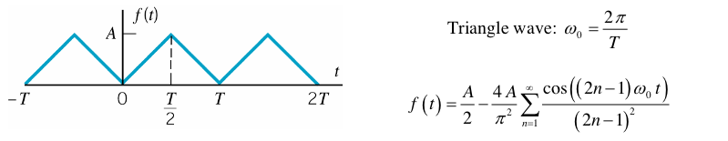
The Fourier Series for a triangle wave is presented in Figure 10 below.
Figure 10. Fourier Series of a triangle wave
Similarly to what we did in creating Figure 7, use the subplot
function in MATLAB
to show the effect of combining the first, second, third, and fourth harmonics
individually. These harmonics correspond to index values n = 1, 2, 3, and 4 in the series
(in Figure 10), respectively.
For this problem, choose the fundamental frequency \(f_0\) = 100 Hz.
Plot over three periods (i.e. plot over the time interval \(0 \leq t \leq 1/T\)
where \(T=1/f_0\)).
Present your plot and accompanying MATLAB script in
Slides 9 - 11
Use use a for loop to approximate the triangle wave with
1000 harmonics. Present your plot and accompanying MATLAB script in
Slides 12 - 13
Periodic and quasi-periodic signals
Consider the following continuous time signal: \(x(t)=\cos(2\pi f_1t)+\cos(2\pi f_2t)\).
If \(f_1 = 8\) Hz and \(f_2 = 10\) Hz, what is the fundamental frequency \(f_0\) of this periodic signal?
Present your derivation and answer in Slides 14.
Plot this function over three periods to prove your answer.
Present your plot in Slide 15.
Now change the first frequency component to \(f_1 = 5 \pi /2\) Hz (however, let's keep \(f_2 = 10\) Hz the same as before).
This new
signal is not periodic since \(f_1\) and \(f_2\) do not share a common divisor.
Plot this new signal over the same time span as in your previous plot. Present your plot
in Slide 16.
Spectral analysis
Download the file Mystery_tone.mat
This file contains a "mystery tone", which is just a simple sinusoidal tone with an amplitude of
2 and a yet-unknown frequency and time duration. The easiest way to load the file into MATLAB is to download the file
to your desktop and then manually drag the file icon into MATLAB's workspace. MATLAB should then load the file.
The more "traditional" way of loading the file is by using the load command.
Once the file is loaded into MATLAB, you can see what variables are saved in the .mat file
by simply typing whos in the Matlab Workspace. You should see that there is a single
variable y saved in the file. This variable y is an array of numbers - it is the "mystery tone"!
Make a simple plot of the signal by entering in the command plot(y). Present your plot
in Slide 17. Since plot(y) does not say anything about
the x-axis, the x-axis will simply be a sequence of increasing integers starting from 1 and ending at the integer that
corresponding to the length of the signal itself. The length of variable y can be found using
MATLAB's length command.
The reason why I've been referring to this as the "mystery tone"
is that the frequency is unknown. Right now, I have not given you enough information
to determine the frequency of the tone. This signal could be a 1 Hz sinusoid or a 100 GHz sinusoid.
We just don't know. As of yet, the signal is just a sequence of numbers stored in a computer
that looks like a sinusoid when you plot it.
The key piece of information missing is the sample rate. So let me tell you the sample
rate now: the sample rate is \(f_s = 3\) kHz.
Given the sample rate \(f_s = 3\) kHz, you are to plot the signal
over time (using plot(t,y)) and determine the frequency of
the tone from this plot (the time between peaks is the period T and the frequency
is equal to 1/T).
This will involve you creating an array t,
which contains the discrete points in time in which the signal has been sampled.
Present the frequency and accompanying plot and MATLAB script in Slides 18 - 20
Use MATLAB's FFT function to determine the frequency of the tone. How does this answer
compare to that determined using the method above? Present your results (including a plot of the FFT and accompanying MATLAB script) in
Slides 21 - 23.
References
J. Sprunger and M. Aboy, Computer Explorations in DSP
Laboratory 1 - Working with Signals in MATLAB , prepared for EE 430, Oregon Institute of Technology, 2013.